Monday, 31 October 2011

Learning Illustrator

Having so many issues learning illustrator from online tutorials! They seem to speak in illustrator which is rather annoying- 'let me just vector that' or whatever. WHAT DOES IT MEAN?! So literally have to do the 'Illustrator for beginners' ones which do not look as cool as the other ones :(  Also, the American accents are really starting to grate. S'all I'm saying.
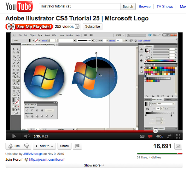
This one seemed really cool but again, too difficult for my meager skills.
Tried to search for 'beginners Illustrator' but all the videos that came up were just of the pen tool (which have got a vague grasp of) and making shapes.
HA! Just had a look on google with 'illustrator tutorials' and this woman says she can teach you...in 23hours 12 minutes. Oh but you can only look at them if you give her money. Bad luck really, was so looking forward to that day of Illustrator.    Rats.
Ok this really isn't going to work- I don't understand the tutorials as my illustrator is COMPLETELY DIFFERENT. Where are they getting all these little pop ups from?!
Next plan of action- written tutorials...

Found this one which looks vaguely do-able

Am totally gonna nail this shell thing.
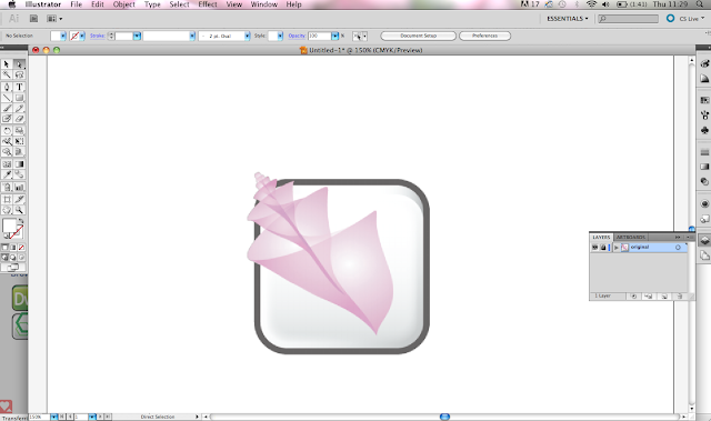
Ok so I imported a picture I found on google of the same Adobe Bridge shell logo, made it my layer 1- put 50% invisibility on it...its all going very well.


Started then to use the Pen Tool to make the shell. Not as easy as first envisaged. Am rubbish at pen tool it turns out, but it doesnt really matter- will use that white clicker thing to change all my angle points. PLAN.

Mine doesn't look too similar to the lady's shell but figure it will all be ok as at the end hers does not even have a black outline. Maybe we delete it later?

And this is where I came to an abrupt halt. After nearly 3/4 of an hour carefully outlining a shell I cannot understand what she means with '2 colour radial gradient'. I'm not entirely sure where I put the two colours to make up a gradient. Might ask one of the IT tekkies to help me. I tried, just to put some colour into it, to do the 'fill' but turns out Illustrator not only has no 'fill' button (or if it does- where is it?!) but I cannot seem to group the first layer of lines together. I literally have anger in my heart for this programme.

Friday, 28 October 2011

Reading Week

Over reading week I visited Compton Verney, an art gallery about 3 miles away from my house. They were showing Quentin Blake and as he's only like THE BEST THING EVER I went (ran) over to see it.

Quentin Blake - As large as life

15 October 2011 to 11 December 2011

Quentin Blake is one of Britain's best-loved and most successful illustrators, having won countless awards and appointed Britain’s first Children’s Laureate. He is known by young and old alike, his name having been synonymous with his illustrations for Roald Dahl’s books. Recently Quentin has been commissioned by hospitals in the UK and abroad to produce works which have a therapeutic effect on their residents. Quentin Blake - As large as life brings together over 60 works for the first time at Compton Verney, for visitors to experience their effects for themselves.


I thought these were just so great- after I'd finished going round the exhibition I went straight back to the beginning to have another look around.
 

Thursday, 27 October 2011

The finished ring!

The week before reading week turned out to be the last few days I could use the jewellery workshop for as they were moving the whole department down a room- plus Malcolm wouldn't be in for the week after reading week and so I had to finish off my ring on the Wednesday. Unfortunately, Malcolm finished at 4 and my elective started from half 4 til half 7 so Malcolm suggested I sneak into the later jewellery class to finish it off.
It was a very busy class but did manage to bag myself a space and sort out the pegs that would clip my piece of acrylic into place.
I had to half bend the pegs over the acrylic to see how much I needed to cut off and then carefully drew a line where I needed to saw. After I had sawed off each peg to the right size I then used a fine file to get rid of the sharp edges and used the pliers to bend the copper back around the acrylic.


Monday, 24 October 2011

Soldering

I began this session by cutting a tiny piece of soldering with metal cutters and then using the flux (in the picture below) and painted some of the flux onto the ring around the place I was soldering. This would help the ring stay clean during the torching. I then placed the tiny piece of soldering onto the gap in the rings and placed them on the fire bricks. Using the torch I then gently waved a medium heat flame over the rings, gradually heating them up, until the soldering began to melt and started to run through the gap. To make sure the soldering ran evenly, I heated both rings until they glowed an even red colour.


I had to slightly enlarge each ring with the metal instrument below and a hammer. To ensure that the soldering was not put under pressure and snap under this process, you needed to keep turning the ring around and hammer all over the ring to get an even enlargement.


There was some soldering raised from the rings' surface so used a small file to bring it down and then used a 800 sandpaper (fine grain but not too fine) to gently polish each, and then I used an even finer grain of 1200 to get a smooth and even surface on each ring.


 I then used tweezers to hold the rings in place whilst I soldered them to the back of the ring piece.
This was incredibly difficult to do as you had to make sure the tweezers did not fall even slightly out of place as this would affect the use of the ring.

 
I used the liquid flux again to place the squares of solder next to where they needed to fuse the rings to the back of the copper plate.

I attempted to do this process by myself but it went so badly wrong that Malcolm had to do this one for me :(  I think where I went wrong was that I did not angle my flame enough so the soldering did not flow into the right places. I also did not hold the flame over the rings and base enough to evenly heat it which definitely hindered its success.


To clean the ring up I placed it in the tumbler for 15 minutes instead of using the pickle solution.


After the tumbling process...


Friday, 21 October 2011

Re-printing the Notre Dame

Went back into the print rooms, determined to get a good print this time!
Shame I completely forgot my camera but oh well.
Luckily they had not removed my screen of the Notre Dame I had made from before so I used that again.
Made two more screens this time- both A2 to fit under my drawing of the Notre Dame.
One was just a block outline of the building, with a hole left from the middle for the centre circle window.
Excuse my very crude drawings..but this is what one screen looked like:
 
And this was the second:
 
I printed the first screen in dark blue then tried to line the drawing up to print over the top in lighter blue.
I did not manage to line the two colours up so in my prints there are a few white lines around the building which I actually really like.
I then printed the Notre Dame screen in black over the top.
The process was quite long at first- making the two extra screens to print- but when I started printing I found that I was really enjoying the pace of work.
This is one of the final pieces I printed:
I am really pleased with the way this print has come out. I love the quality of the lines the printing gives and by using the different screens, feel like I have tried something new in the print rooms.


Evaluation So Far

I am really enjoying this project- I love learning new things and have really enjoyed learning jewellery processes. I found my timekeeping last year was not so good- and have made a real effort in this project to keep on top of things. I found that keeping up my blog really helped me see where I had to go next and in the end I liked blogging about the stuff I was working hard on. I found that some processes, like screen printing, took forever but I was really pleased with the results. I would have liked to try other techniques in the print rooms- like lino or etching- but felt that my time could be better used learning what I could in the jewellery rooms while Malcolm the technician was still around. I am still finding it hard to blog about other artists- I just keep forgetting to research more people instead of more resources I could use.
I did find the Illustrator lesson very helpful and over Reading week I want to research online tutorials into some more tools I can use on the programme. Over Reading week I want to research into the materials I have used in jewellery- copper vs brass etc and also reflect further on my processes within this project.

Tuesday, 18 October 2011

Making the Notre Dame Ring

While my second silicon mould was setting, I went into jewellery and Malcolm suggested that I continue with my other ring design- the copper plate with the clear acrylic shape clipped over the top. So did that this evening.
Started by polishing a piece of copper on the mechanical polisher with the rouge. Found that I had to wear gloves for parts of it as the metal got extremely hot very quickly.

I then drew around my acrylic circle and added extra pieces where the copper was going to clip onto the circle.
After I had done this I used an extremely thin saw to gently cut through the copper plate.
 

When I had finished sawing all the edges, I filed down the piece of metal which was a very long process. I then had to re-polish it until both sides were finished.


After I had done this I then set about creating my rings to go underneath. I selected the right measurement for my two fingers and then wrapped a length of wire around the right selection on the ring pole. I then cut the wire at the top of the circle, and measured out how much copper wire I would need for both rings.

 
Then I used the blow torches to heat up the copper wires, making it more malleable and then left them in the 'pickle' for about 5 minutes to get them really pliable.


I then used wire cutters to gently roll up the wire, and some parallel cutters to ensure the two ends met without too much of a gap.


And voila! My two rings ready for soldering in the morning!


Two Colour Screen Printing

Went to the Rossington St print rooms again; made up another screen this time only A4 and printed the main circular window onto it. Thought it would look quite good behind the print of the Notre Dame but when I printed the building over my initial print I hated it. Because the back print is too high up it looks like some kind of cult sunrise symbol. Anyway, will probably try printing it again with just block colours behind this time instead of anything too complex.
This one got a bit crumpled in the screen printing process- even though I had the vacuum on and everything...

Cant really tell from this photo but this print was done on a light grey paper.

VINCENZO RIZZO

Just having a browse through etsy.com and found this guy who is selling his work for about $10 on the site- totally incredible.


Silicon Mould


Went into ceramics again this morning to see how my mould had set. Was not totally happy with the results- around the edge the silicon had not flowed into the tiny patterns so had to do the whole thing again. This time, though, I used a thin paintbrush to paint the silicon into each individual hole. Hopefully it will be set in a few hours and I can still do my pewter pouring.

Monday, 17 October 2011

JULIE ALLEN: Fiber Food

Was tempted to do this kind of thing to my croissant...
That would be awesome.


DANIEL KORNRUMPF

Another artist I found on Mrs Textiles- This guy's work is so amazing! The intricacy of his work is just stunning- his threads look like brush strokes almost.


LOUISE RILEY

I found this artist on Mrs Textiles blog. Riley's work is done on discarded mattresses on which she embroiders people in sleeping positions. Her work is fhaaabulas and if I could embroider I would totally do this. But I cannot.